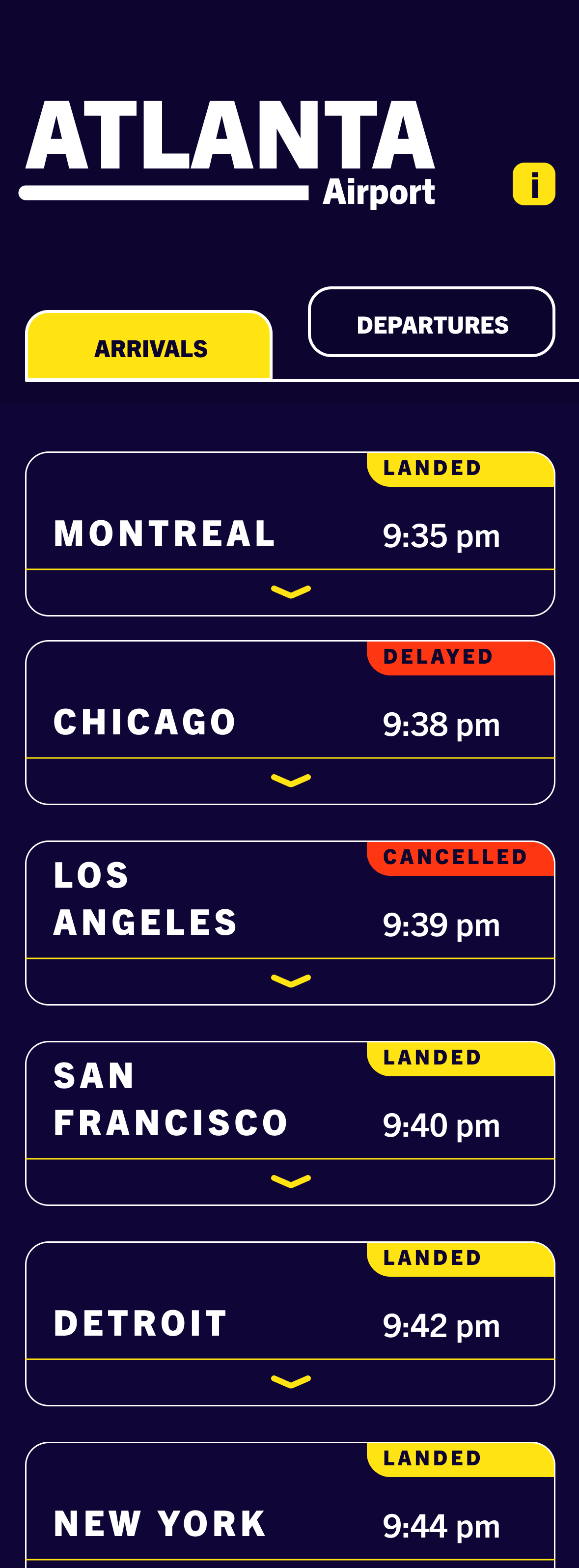
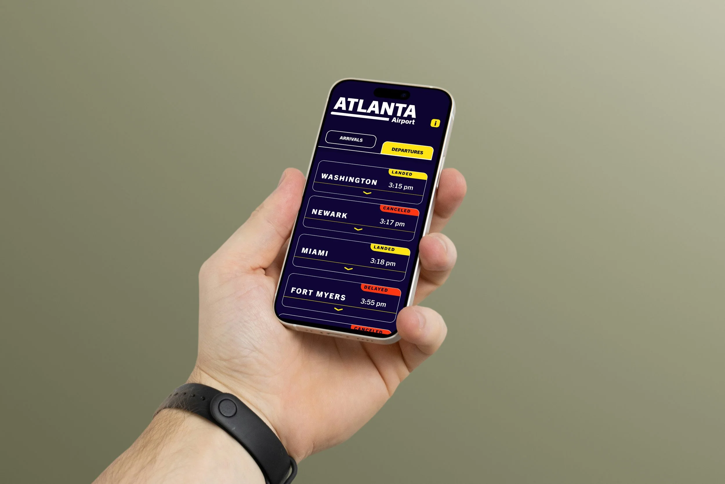
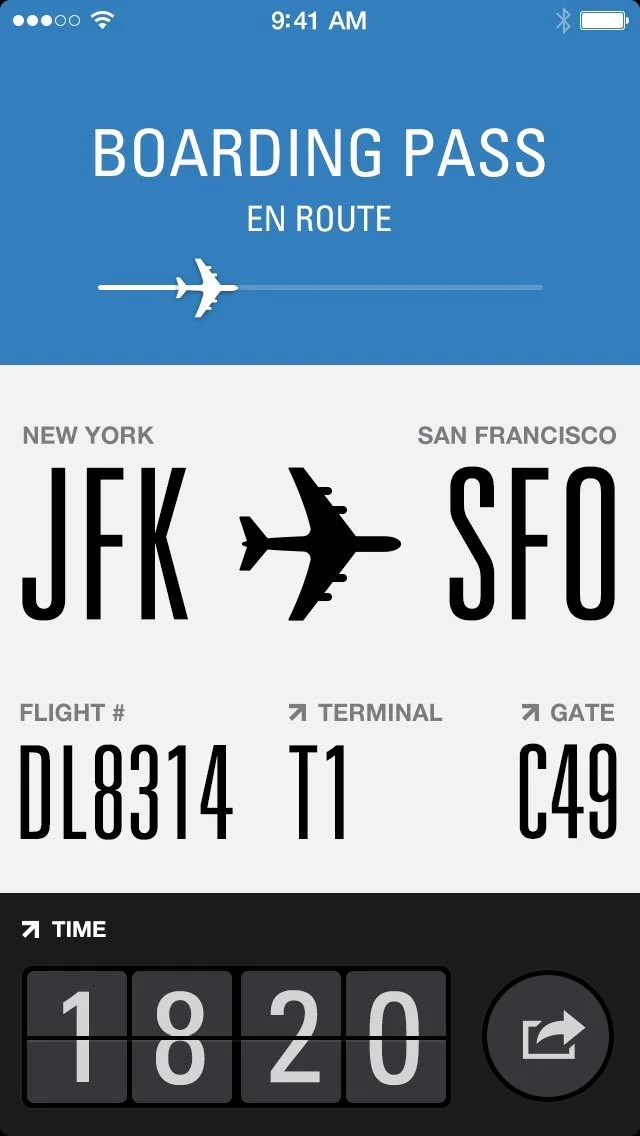
airport app interface
Navigating an airport tends to be a stressful experience for people of all ages and backgrounds. Apps can help simplify the experience and make information easily accessible for everyone who flies.
design purpose
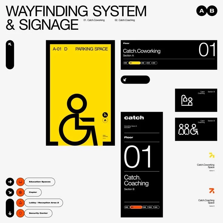
As a first-year typography project, we were tasked with trying our first attempt at interface design through Figma. By keeping in mind inclusivity and the purpose of clearly presenting directional information, I carefully constructed an app interface for the Atlanta International Airport.
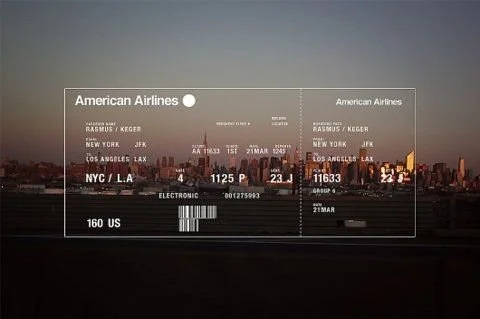
Inspiration
Having always noticed but never studied any kind of interface design, I surfed the web and conducted my own personal research to find inspiration for what does and doesn’t work in the realm of UI.
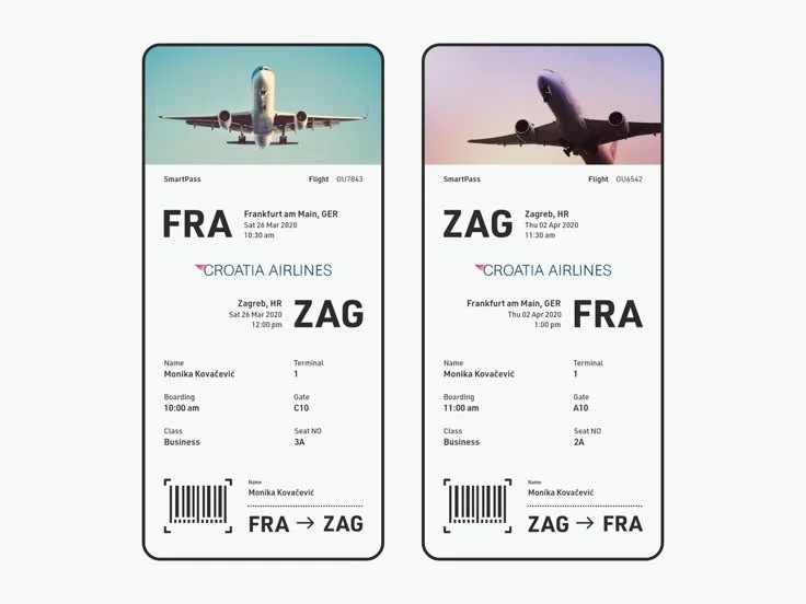
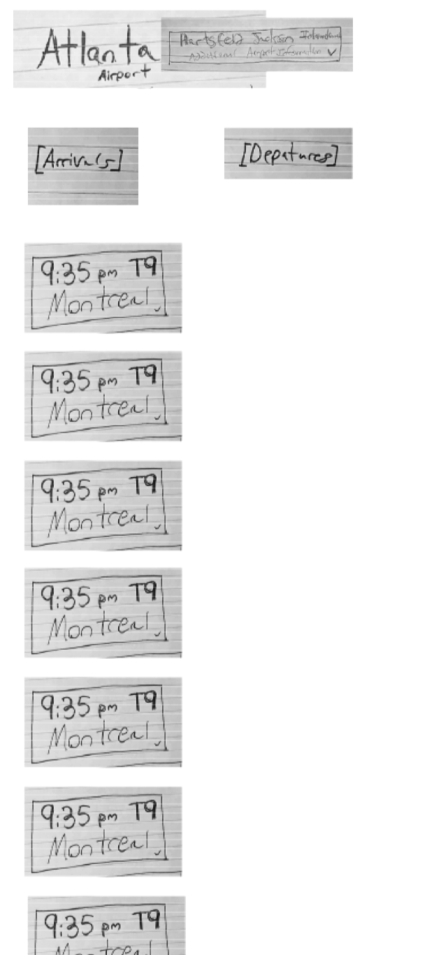
sketching the pieces
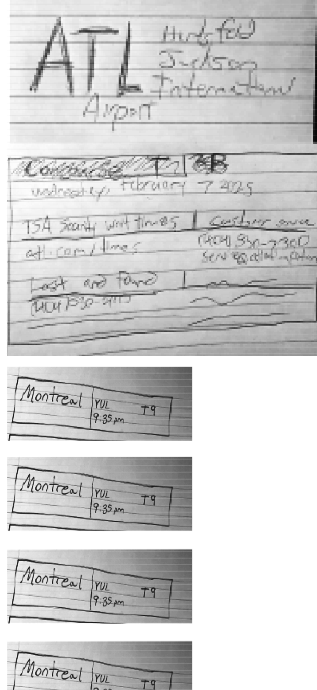
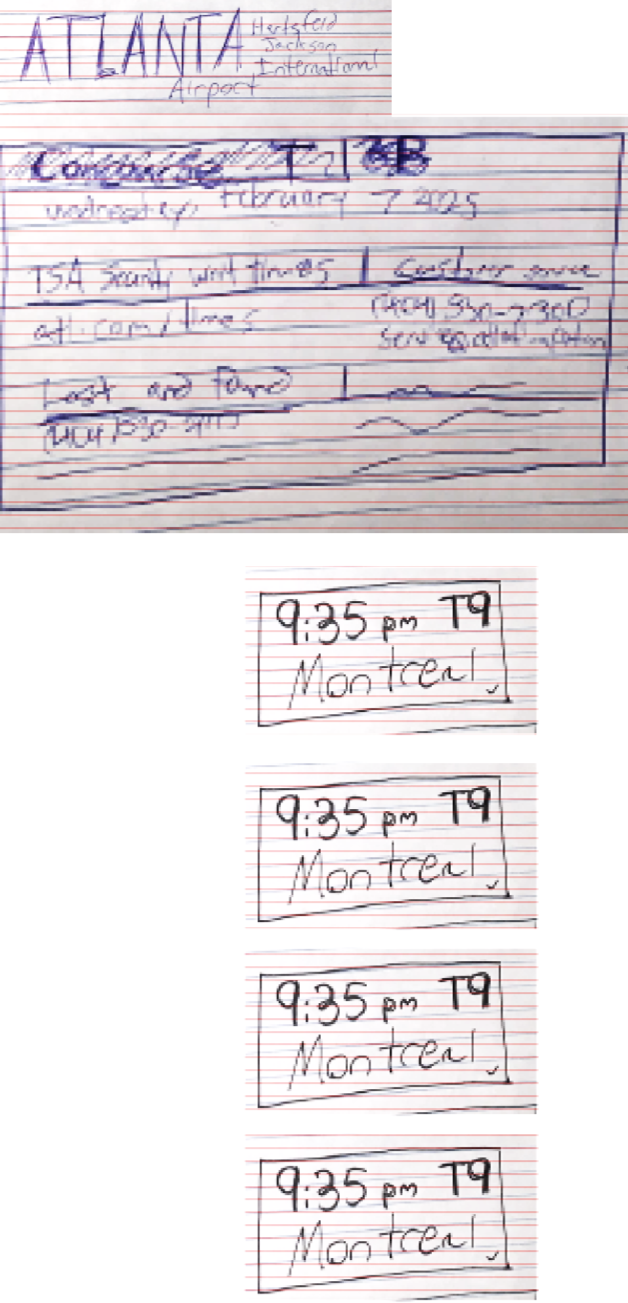
After sketching different pieces of the screens, I cut and pasted them together to help organize cohesive systems to build off of later within my design process.
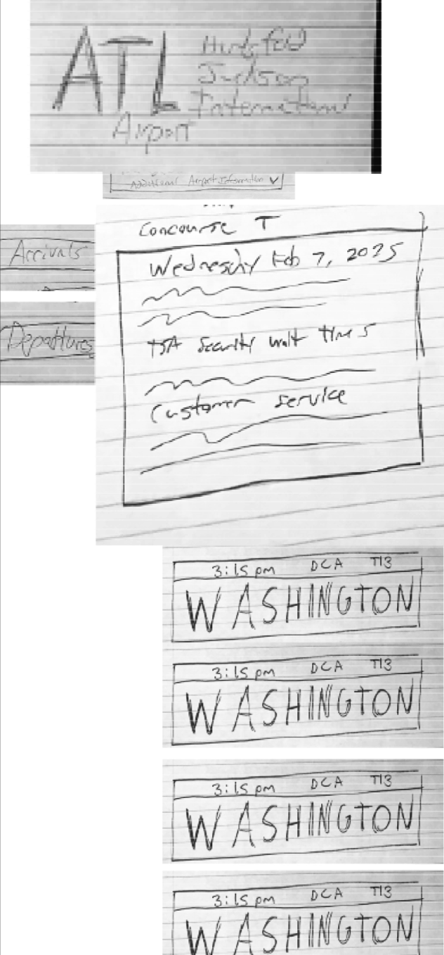
Directions
It’s important to throw different ideas at the board and consider multiple directions before committing to a singular idea. By building each screen one piece at a time, I came up with a few different ideas for how they could look before settling on one in more depth.


Development
Ideation and iteration
By completing several stages of ideating and iterating on how the screens for my app should look, I reached a point in development that felt satisfying and could then move on to refinement.
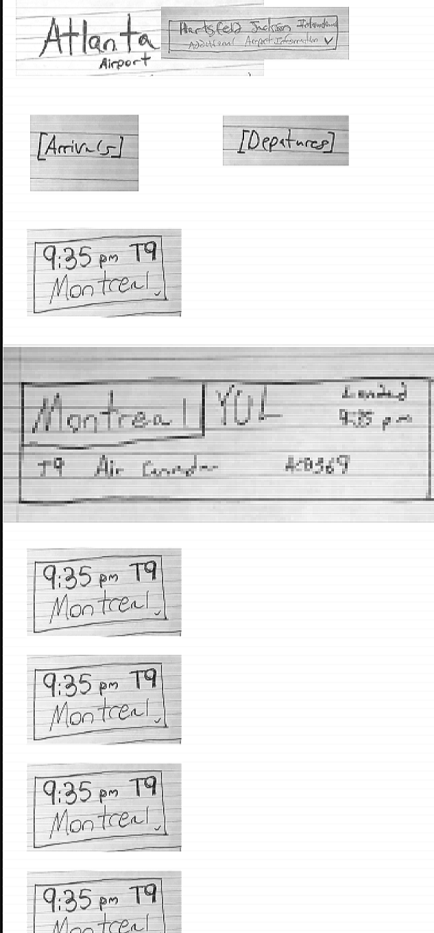
Refinement
Making small changes and edits to my screens, I continued refining the designs until I reached an end result that reached my intended goals and purpose.


fInal screens
I wanted my end product to be an app that felt convenient for the user in both practicality and visual aesthetics through the use of high contrast in color and spacing, as well as an emphasis on typographic clarity and visual cohesion.